Design is the
process of collecting ideas and these ideas implementing them. We also involve
website layout, website structure, user interface, navigation, colors, font,
image gallery, button styles etc.
Here we
discussing the all web design layout because you are a professional web
designer first of all you understand the terms and tools of designing.
Types of Layouts:
Static Page Layout:
Static Websites
layout to give the fixed width to present sites and not changes the width on
browser, or we can say you can’t update the content in static website. It has
the advantage of this static layout is light on code so loads faster than
another website. We design the layout static websites from 1 page to hundreds
of pages. If you can seen on small pc and horizontal part is small then scroll
bar display and you can seen in mobile or tablet you can zoom the screen in
interesting points. cost is generally less than dynamic.
Dynamic Website Layout:
Dynamic Website design can be simple
or complex depending on the customer's design / development needs. Usually for
Simple Dynamic Website Designs, we only charge for Hosting / Domain yearly
fees. You can create dynamic website such as JavaScript, .net, .php, open
source, jquery etc with your creativity to design and development. Easy to add
and manage content with the help of CMS.
Fixed design Layout:
A fixed website design layout has a covering that is a fixed width, and
the components parts inside it have each percentage widths or fixed widths.
When the browser on a screen is distended or reduced, images and text may
visually fall not together on the screen. Most website users are assumed to
browse in 1024×768 resolution or higher in fixed design layout.
Also Read: Magento Store Development - Create A Effective With Magento Reward
Also Read: Magento Store Development - Create A Effective With Magento Reward
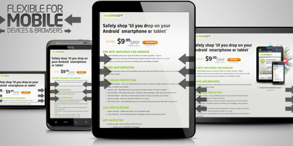
Responsive design Layout:
This approach aims to make website presentation easier by displaying
websites on different devices in forms that are easy to read and
navigate. Explore what makes a site responsive and how some common
responsive design patterns work across different devices. Websites created
using responsive design are designed to display different content as the
browser is expanded or reduced to predetermined sizes.
Liquid or Fluid design Layout:
When
resizing the browser, the content on the page spreads itself out to fill the
width of the browser when expanded, hence the term liquid design, and will look
enlarged or as though it has shrunk. It helps a great deal in making the entire
website work fine on different browsers and also Setting up multiple widths to
videos, content, images to fit different screen resolutions is hectic for
designers.
Single page design Layout:
One-page websites are hot and popular-no doubt about
that. He best single pages are those that help you convey your message into few
quick scrolls. They are well designed and compatible with most Internet
browsers. Ne page sites provide a linear journey for the user and work particularly
well for devices where scrolling is the main form of navigation.


